#bootstrap 5 homepage
Explore tagged Tumblr posts
Visit Tumblr Blog
Explore Tumblr blogs with no restrictions, modern design and the best experience.
Last Seen Tumblr Blogs


Fun Fact
There were a total of 171.5 billion posts on Tumblr in 2019.
Text

Bootstrap 5 Homepage with video background
#bootstrap 5 homepage#bootstrap homepage design#homepage design html css#bootstrap 5 snippets#homepage video background#html css#responsive web design#responsive layout#html5 css3#responsive#code snippets#learn to code
1 note
·
View note
Text
Tryesy – Creative Digital Agency WordPress Theme

Tryesy – Creative Digital Agency WordPress Theme is your go-to toolkit for standout websites. Built with Bootstrap 5 and Elementor, it offers 3 homepages, fluid transitions, and mobile-optimized design.
Whether you're a designer, agency, or freelancer, Tryesy blends style with performance to captivate visitors and elevate your digital presence.
#CreativeAgency#DigitalDesign#PortfolioShowcase#WebDesignerLife#UIUXDesign#WordPressTheme#ElementorDesign#Bootstrap5#ResponsiveDesign#WebDevelopment
0 notes
Text
How to Upgrade Your Brand’s Visuals Without Breaking the Bank
Visual branding is the first impression your audience forms—before they read a word or hear your pitch. But when budgets are tight, especially for startups and small businesses, design often gets pushed aside or handled with quick DIY tools. The result? A visual identity that lacks polish, consistency, and impact.
The good news? You don’t need a massive budget to make your brand look sharp and professional. By being intentional and resourceful, you can elevate your brand’s visual presence in meaningful ways. With access to the right Graphic Designing Services, even small investments can lead to big improvements.
Let’s explore how you can upgrade your visuals without draining your wallet.
1. Start With a Brand Audit
Before spending on new design work, take stock of what you already have. Look at your:
Logo
Color palette
Fonts
Website graphics
Social media templates
Marketing materials
Ask yourself:
Do they feel modern and consistent?
Are they aligned with your brand message?
Do they perform well across devices and platforms?
This brand audit will help you identify gaps and prioritize the most important upgrades first—so you're not wasting money on what doesn’t need fixing.
2. Focus on High-Impact Touchpoints First
You don’t have to redesign everything at once. Instead, focus on the visuals that make the strongest impression on your audience:
Your logo and favicon
Website homepage banners
Social media profile images and cover photos
One or two branded templates for Instagram or LinkedIn
Investing in just these can immediately boost your perceived professionalism and brand recall. You’ll look more credible even before a full redesign.
3. Use Templates Strategically
Design templates are a great budget hack—when used correctly. You can purchase or create branded templates for:
Social media posts
Stories and reels
Email newsletters
Presentation decks
Once customized with your brand colors, fonts, and tone, these templates ensure consistency while reducing turnaround time. You don’t need to design from scratch for every new piece of content.
Tip: Avoid using free templates as-is. Personalize them enough so your brand doesn't look generic or templated.
4. Try a Design Retainer or Package Deal
If you need ongoing design support but can’t afford a full-time designer, look for agencies or platforms offering monthly packages or hourly retainers.
You get access to professional creatives at a fraction of the cost—plus the benefits of consistency, fast delivery, and brand understanding over time. Some even let you scale up or down based on your workload.
Instead of juggling multiple freelancers, consider a compact, on-demand design service model that fits your business rhythm.
5. Invest Once in Core Brand Assets
Certain things are worth the upfront investment, even if you’re bootstrapping. These include:
A well-designed logo
A compact brand style guide (colors, fonts, voice)
A few high-quality icons or illustrations
A set of visual rules for how to use design elements across platforms
These core assets can be reused and repurposed across all your materials. They also help future freelancers or design partners work more efficiently without reinventing the wheel.
6. Leverage Low-Cost Design Tools (the Smart Way)
Canva, Figma, Adobe Express, and other tools make it easier than ever to handle simple design tasks in-house. You don’t need to be a designer—but you do need brand-ready assets to start with.
By using pro-made templates and combining them with a consistent design system, you can produce solid visuals with limited expertise. Just make sure you’re not sacrificing clarity or brand coherence in the process.
7. Don’t Forget About Mobile and Speed
Even the best designs fail if they’re slow to load or don’t work on mobile. Make sure:
Image sizes are optimized for web
Fonts are legible on small screens
Visuals aren’t overcrowded or cluttered
Mobile-first thinking can increase engagement without spending more—just better design choices.
Conclusion: Design Smart, Not Expensive
A beautiful, cohesive brand isn’t reserved for companies with deep pockets. With a thoughtful approach, clear priorities, and access to expert Graphic Designing Services, you can upgrade your visual identity without stretching your budget.
From leveraging retainer-based services to investing in essential brand elements, the goal is to spend where it matters most—and skip the rest. Because in today’s visual world, your audience will judge your business in seconds.
Make sure what they see reflects who you are—and where you’re headed.
0 notes
Text
Luminos – The Ultimate WordPress Theme for IT Solutions & Technology Companies

In the fast-evolving digital landscape, a strong online presence is no longer optional—it’s essential. Whether you’re running a SaaS startup, a tech consulting firm, or a full-fledged IT service agency, your website is often the first impression you make. That’s where Luminos – IT Solutions & Technology WordPress Theme steps in.
Designed with precision and packed with powerful features, Luminos empowers tech-focused businesses to create modern, responsive, and high-performing websites with ease. It’s more than just a theme—it’s a smart digital foundation for your brand.
🚀 Why Choose Luminos?
1. Built for IT and Tech-Oriented Businesses
Luminos is crafted specifically for:
IT service providers
Software development firms
SaaS & app startups
Web design agencies
Digital consulting companies
It understands your niche—and it shows in every design element and feature.
2. Stunning Design with 5 Unique Homepages
Choose from 5 professionally designed homepage variations, each tailored for a different type of tech business. Whether you're promoting cybersecurity services, cloud computing solutions, or software products, there's a layout that fits.
3. Elementor Page Builder – No Coding Needed
Luminos is fully integrated with Elementor, the most popular drag & drop page builder for WordPress. Design and edit your pages in real time without touching a single line of code.
4. 100% Responsive and Retina-Ready
Luminos delivers a seamless user experience across all devices—from desktops to smartphones. It looks pixel-perfect and loads quickly, ensuring your visitors stay engaged.
5. Essential Inner Pages Included
The theme comes with 20+ inner pages to handle everything your business needs:
About Us
Services & Solutions
Case Studies
Pricing Plans
Careers
Blog & News
FAQs
Contact Page with Google Maps
These pre-designed pages save time and ensure a consistent user experience.
6. WooCommerce Ready
Planning to sell products or services online? Luminos is fully compatible with WooCommerce, allowing you to set up a shop or accept online payments with ease.
7. Multilingual and RTL Support
Go global with confidence. Luminos is compatible with WPML and supports RTL languages, making it easy to build a multilingual site that appeals to international audiences.
8. One-Click Demo Import
Get started instantly by importing the full demo content with a single click. Customize it to match your brand, and launch your site faster than ever.
9. SEO Optimized and Performance Focused
Built on modern coding standards, Luminos ensures your website ranks well in search engines and loads lightning fast. It’s designed to boost both visibility and performance.
🛠️ Key Features at a Glance
5+ Homepage Variations
20+ Inner Pages
Elementor Builder
Bootstrap Framework
One-click Demo Import
RTL & Translation Ready
Contact Form Integration
Font Awesome Icons
Cross-browser Compatibility
Free Lifetime Updates
🎯 Who Should Use Luminos?
If you are a:
SaaS Founder
IT Consultant
Software Developer
App Creator
Tech Support Provider
Digital Product Vendor Luminos gives you the tools to build a professional, modern website that converts visitors into clients.
💡 Final Thoughts
In a world where technology drives business, Luminos – IT Solutions & Technology WordPress Theme gives you a serious edge. Its clean design, versatile layouts, and robust functionality make it a top choice for any tech-driven brand looking to grow online.
So why wait? Give your IT business the digital home it deserves.
👉 Check out Luminos now on ThemeForest
0 notes
Text
Industrie - Factory & Industry HTML Template

Industrie- a multi-purpose business HTML Template. This template built with 24+ awesome demos and these domes are designed and developed specifically for Industry, Factory, Metallurgy, Construction, Laboratory, Renewable Energy, Oil & Gas, Robotic, Architecture, Manufacturing, Engineering and also these are suitable for any business websites.
It comes with high-quality 24 Demo Homepages (12 Multi Home + 12 Onepages) and 32+ built-in awesome pages such as service pages, projects pages, team pages, testimonials pages, multiple blog layouts etc. It’s also 100% responsive that’s why it will work nicely on all smart devices(smart phones, tablet, PCs and desktops). It’s also well documented and clean coded that’s why anyone can change it easily.
Features:
24 Demo Homepages (12 Multi Home + 12 Onepages)
57+ HTML Pages Included
Fully Responsive Design
Built with Bootstrap 5.x
Google Fonts
Blog Page Included
Awesome Case study styles
Working Ajax Contact Form Included
Google Map
Google Fonts
Pricing Table
Testimonial
Mobile Browsers Compatible
Font Awesome Icons
W3C Valid HTML Code
Cross browser Compatible
Reliable support
Well Documented That’s Why Easy to Change
and much more
ZIP file contains:
HTML files
CSS files
Font files
JS files
PHP files
Documentation files
Support:
We always happy to help our customers. If you have any issues, pre sale questions or ideas, please feel free to contact us anytime. We always try to reply your questions within 24 hours.
0 notes
Text
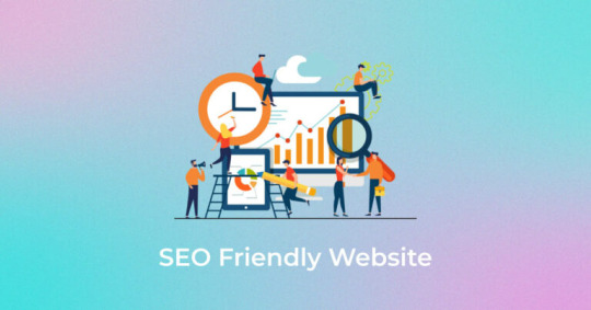
Crafting SEO-Friendly Websites: A Developer’s Roadmap to Visibility
In today’s digital ecosystem, a website’s success hinges not just on sleek design or functionality, but on its ability to be found. For developers, weaving SEO into the fabric of your build process isn’t optional—it’s critical. At CodingNectar.com, we’ve seen how SEO-savvy development drives traffic and growth. Let’s break down how to engineer websites that both users and search engines love.
1. Architect with SEO in Mind
A website’s structure is its backbone. Imagine constructing a skyscraper: without a blueprint, chaos ensues.
Flat Architecture Wins:
Keep pages within 3–4 clicks from the homepage for easy crawling.
Avoid orphan pages—every page should link back to your main navigation.
URLs That Speak Clearly:
Ditch cryptic strings like /page123. Opt for descriptive paths (e.g., /guides/seo-for-devs).
Use hyphens (-) to separate words—search engines read them as spaces.
Pro Tip: Tools like Screaming Frog act as X-ray goggles, uncovering broken links or duplicate content.
2. Nail Technical SEO Foundations
Think of technical SEO as the plumbing—it’s invisible but essential.
Mobile-First Isn’t a Trend, It’s a Rule:
Use responsive frameworks (e.g., Bootstrap) and test with Google’s Mobile-Friendly Tool.
Speed Is Non-Negotiable:
Compress images to WebP format (tools: ImageOptim).
Minify CSS/JS files and leverage browser caching.
Guide Search Engines:
Generate an XML sitemap.
Block irrelevant pages (e.g., test environments) via robots.txt.
3. Semantic HTML: SEO’s Best Friend
Clean code isn’t just for developers—it’s a love letter to search engines.
HTML5 Tags Are Your Allies:
Use <header>, <nav>, and <article> to add context.
Headings Hierarchy Matters:
One <h1> per page (your title), followed by logical <h2>-<h6>.
Alt Text: Describe, Don’t Keyword-Stuff:
alt="developer optimizing website speed" beats alt="SEO tips".
4. Ace Core Web Vitals
Google’s user experience metrics can make or break your rankings.
Largest Contentful Paint (LCP):
Target <2.5 seconds. Optimize hero images and lazy-load offscreen content.
First Input Delay (FID):
Defer non-critical JavaScript.
Cumulative Layout Shift (CLS):
Reserve image/video space with width and height attributes.
Test Tools: Google PageSpeed Insights and Lighthouse are your go-to auditors.
5. Content: Where Code Meets Strategy
Developers wear many hats—content strategist included.
Keyword Research:
Tools like Ahrefs uncover gems (e.g., “optimize Angular SEO” vs. generic terms).
SPA Challenges:
Use server-side rendering (Next.js/Nuxt.js) for React/Angular apps.
Canonical Tags:
Fix duplicate content with <link rel="canonical" href="https://your-primary-url">.
6. Security & Accessibility: SEO’s Silent Allies
HTTPS is Mandatory:
Free SSL via Let’s Encrypt boosts trust and rankings.
Accessibility Enhances SEO:
ARIA labels (e.g., aria-label="Contact form") aid screen readers and search bots.
7. Structured Data: Speak Google’s Language
Schema markup helps search engines “get” your content.
JSON-LD Example:
html
Copy<script type="application/ld+json"> { "@context": "https://schema.org", "@type": "Guide", "name": "SEO for Developers", "author": "CodingNectar.com" } </script> Run HTML
Validate with Google’s Structured Data Tool.
8. Monitor, Tweak, Repeat
SEO is a marathon, not a sprint.
Track Progress:
Google Search Console reveals crawl errors and keyword performance.
Moz or Ahrefs monitor rankings.
Fix Issues Promptly:
Redirect broken links (301s) and refresh stale content.
Avoid These SEO Blunders
Neglecting Mobile: Most searches happen on phones.
JavaScript Overload: Heavy scripts slow crawlers.
Duplicate Content: Canonical tags are your safety net.
Cheap Hosting: Slow servers = lost rankings.
Final Take: SEO is Part of Your Code
Building SEO-friendly sites isn’t about gaming algorithms—it’s about creating fast, accessible, and intuitive experiences. By embedding SEO into your development DNA, you’ll future-proof your work and unlock organic growth. At CodingNectar.com, we’ve turbocharged rankings for everyone from startups to Fortune 500s by merging technical rigor with SEO strategy.
Ready to code your way to the top? Start with SEO in your toolkit—your analytics will thank you.
0 notes
Text
Panno - The Plants & Organic Food eCommerce HTML5 template
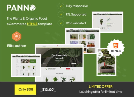
Panno is a creative and modern, boostrap eCommerce HTML5 template that can be used for online store selling plants, organic foods, or other related products, the Plants & Organic Food eCommerce HTML5 template is a great option. This template provides a user-friendly experience for any website managers and customers alike with its sleek and contemporary design.
Panno template look fantastic on all devices thanks to the responsive layout, and customising the template to fit your brand is made simple with the basic customisation options. Panno provides all the features you need to present your items in flair, including multiple homelayout, mobile banner slider, sticky header, product slider, easy to use, unique header & footer style, RTL support, built with boostrap and many more. Regardless of your experience level with eCommerce, this design is a fantastic choice for setting up a polished and eye-catching online store.
Additionally, Panno included premade 62+ pages, with various checkout pages, about us, contact us, FAQs, multiple carts, login and registration, collection page, blog, article page, terms and conditions, and many more that are essential to the creation of any eCommerce site.
Panno Features
62+ Premade pages
5+ Homepage Layout
Bottom Mobile Menu
Mobile Slider Banner
Multiple Product Layout
Blog Layout
Multiple Product Grid Options (3,4 and 5)
Product Stock Countdown
Product Grid & List Options
Various Product Details pages
Unique Sticky Header Variations
Unique & Multiple Footer Variations
Advanced Mega Menu
Mobile Optimized Design
Newsletter Popup
Quick View Design
Collection Pages
RTL Supported
Product Filters
Magnific Popup Integration With Product Slider Image
Ask a Question Features
Amazing 5 stars support
E-commerce Image Swatches
Social Sharing Features
Multiple Product Wishlist Pages Added
Fully Responsive (Tested on Multiple Devices)
Fully compatible with Firefox, Safari, Chrome, Internet Explorer 11+
Build with Latest Bootstrap 5.0.X version
Modern & Clean Design
Google web fonts
Well Documented
SEO Optimization
Clean and Commented code
Life Time Free Update
404 Page
0 notes
Text
Mastering Website Management: Essential Tips for a Seamless Online Presence
In today’s digital landscape, a well-managed website is essential for any business seeking to thrive online. From attracting visitors to ensuring a smooth user experience, effective website management can significantly influence your brand’s success. This guide provides essential tips to help you master website management and maintain a solid online presence.

1. Focus on User Experience (UX)
User experience is the foundation of any successful website. A well-designed site should be intuitive, easy to navigate, and visually appealing. Here are some key aspects to focus on:
Navigation: Ensure your website’s navigation is straightforward and user-friendly. Visitors should easily find what they need. Organize content into logical categories and use descriptive labels for menus and links.
Design: Aesthetic appeal matters. Use a clean, consistent design that aligns with your brand’s identity. Avoid clutter and ensure your site is visually engaging without being overwhelming.
Loading Speed: A slow website can drive visitors away. Optimize your site’s loading speed by compressing images, leveraging browser caching, and minimizing the use of heavy scripts. Tools like Google PageSpeed Insights can help identify areas for improvement.
2. Maintain Fresh and Relevant Content
Regularly updating your website’s content is crucial for keeping visitors engaged and improving your search engine ranking. Here’s how to keep your content strategy effective:
Blogging: Maintain a blog that addresses topics relevant to your audience. Share insights, tips, and industry news to establish your brand as an authority in your field.
Multimedia Content: Use various types of content, such as videos, infographics, and podcasts, to cater to different preferences and keep your audience engaged.
SEO Optimization: Optimize your content for search engines by incorporating relevant keywords, using meta tags, and ensuring your site’s structure is SEO-friendly. This helps improve your visibility and attract organic traffic.
3. Ensure Mobile Compatibility
With the rise of mobile device usage, ensuring your website is mobile-friendly is essential. A responsive design adapts to different screen sizes, providing an optimal viewing experience on any device. Here’s how to enhance mobile usability:
Responsive Design: Use a responsive design framework like Bootstrap to ensure your site adapts seamlessly to various screen sizes.
Phone Testing: Continually monitor how well your website functions when viewed from a variety of mobile devices. Tools like Google’s Mobile-Friendly Test can be helpful.
4. Implement Robust Security Measures
Website security is crucial for protecting your data and building trust with your visitors. Here are some essential security practices:
SSL Certificate: An SSL certificate encrypts data transmitted between your website and users, ensuring secure connections. It also boosts your search engine ranking.
Regular Updates: Keep your website’s software, plugins, and themes updated to protect against vulnerabilities.
Backup: Regularly back up your website to safeguard against data loss. Use automated backup solutions to ensure your data is consistently protected.
5. Utilize Analytics and Gather feedback
Understanding how users interact with your website is critical to ongoing improvement. Here’s how to leverage analytics and feedback:
Analytics Tools: Use tools like Google Analytics to track user behavior, identify popular pages, and understand where visitors are coming from. This data can help you make informed decisions about your content and design.
User Feedback: Encourage visitors to provide feedback through surveys, contact forms, or feedback widgets. User insights can highlight areas for improvement and help you enhance the overall user experience.
6. Optimize for Conversions
Ensure your homepage is optimized for online visitors converting into paying customers. Here are some tips to optimize for conversions:
Clear CTAs: Use clear and compelling calls-to-action (CTAs) to guide visitors toward desired actions, such as making a purchase or signing up for a newsletter.
Welcome Pages: Produce singular welcome pages for precise promotions or incentives. These pages should be focused, with a single CTA and minimal distractions.
A/B Testing: Conduct A/B testing to compare different versions of a page or element to see which performs better. This will allow you to fine-tune your strategies using data for better outcomes.
Conclusion
Effective website management is an ongoing process that requires attention to detail and a commitment to continuous improvement. By prioritizing user experience, keeping content fresh, ensuring mobile-friendliness, implementing strong security measures, utilizing analytics and feedback, and optimizing for conversions, you can maintain a robust online presence that drives success for your business. Don’t forget your brand’s first impression to potential customers is usually your website. Make it worth their while!
0 notes
Text
released a new update for xenia, redesigned some stuff and fixed some bugs :3
ported a decent amount of the styling of Bootstrap 2 to the homepage, which uses Bootstrap 5


Read more at my full blog post :3
https://xenia.kate.pet/blog/20240212-update
0 notes
Text
100+ Navigation Bar HTML and CSS (Free Demo +Source Code)
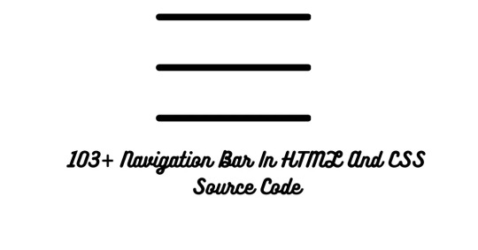
Navigation Bar Using HTML and CSS
Hello Developers! Welcome to Codewithrandom with another informative blog. Today we’ll see how to make a Navigation Bar with Source Code. Here is the Latest Collection of free Navigation Bar codes in HTML and CSS. This is the Updated Collection of April 2023 with 36 New Navbar Source codes added.
What is a navigation bar?
A Navigation bar or a side menu is an integral part of any website, used for quick navigation links, a search bar, login/signup links, company logos, etc. Without a Navbar, any website looks incomplete.
Here we’ll show you how to create a Simple Navigation Bar In HTML and CSS with 100+ examples.
Related article — 100+ HTML, CSS, and JavaScript Projects With Source Code ( Beginners to Advanced)
Restaurant Website Using HTML And CSS With Source Code
Let’s see some cool Navigation bars in HTML and CSS.
1. Responsive Side Navigation Bar
Let’s start our list with a simple, light-themed left-sided navigation bar. Only navigation bar icons are visible on load but on clicking the hamburger icon side bar expands.
2. Bootstrap Navigation Bar
Simple and responsive navigation bar. This one is on top with several different categories and also a search bar. Additionally, it also has a login and signup button.
How To Build Interest Calculator Using JavaScript
3. Transparent Navigation
This is a very well made Navigation bar by Manas Yadav, when you click a navigation bar button it auto scrolls to its location on the page. Can be used for homepages.
4. Sticky Slider Navigation (Responsive)
Another navigation bar auto-scrolls but this one is even better with more satisfying animations and design.
5. Navigation bar design
A navigation bar with a gradient in its background with a cool gradient and blinking effect on hover.
That’s it, folks. In this article, we shared the Navigation Bar In HTML And CSS Source Code with cool and different designs. We covered everything from simple and minimal Navigation bars to bars with auto scrolls, cool transitions, and even 3D icons. Hope you liked this article. Share this with your fellow developers. Comment down below with your thoughts and suggestions
See our other articles on Codewithrandom and gain knowledge in Front-End Development.
Thank you
read full article and get complete source code
1 note
·
View note
Text
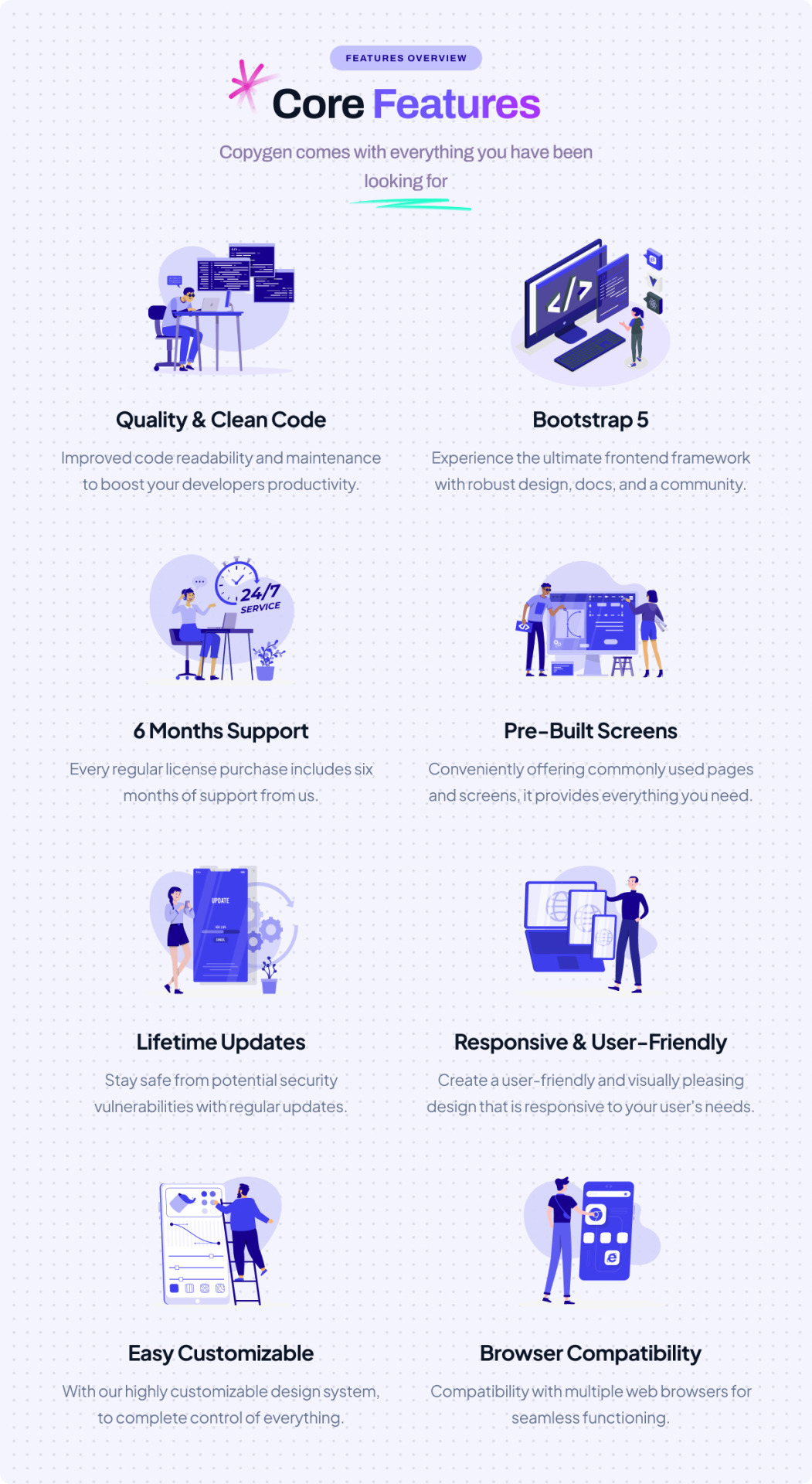
CopyGen – is a responsive website template for AI Content Writing/Generator website. We have designed this template for your new AI Content Writing website just how you like it. So, if you want to create a website for AI Writer, Copywriting, OpenAI Content Generator or AI Content Writing website then CopyGen template will best choice to build your own website.
CopyGen Template is fully flexible, user-friendly and responsive that looks great on every devices as desktops, tablets, and mobiles. This template built with Boostrap 5, HTML5, CSS3, Vanilla JS, SASS and Gulp. It includes 5 Homepage/Landing page, and 20+ pre-built inner pages. It built with well organized folder structure, clean & commented code. We have used gulp-based build tools and stylesheet based on scss variables so you can quickly change the colors, font sizes in variable file.
CopyGen HTML Template Features
4+ Homepages
20+ Prebuilt Pages
Pricing & Use cases Pages
Various Component Ready
Working Contact Form
Clean & Modern Design
Fully Responsive
Mobile first approach design
W3 validated Codes
Cross Browser Compatibility
Bootstrap 5, Vanilla JS, SASS
6 Months Free Support
And many more…
What do you get?
Landing Page HTML Template Files
Stand-alone User Dashboard Template Files
Source of Package (Gulp require to build)
Documentation
Caution: Some images are for preview purposes only and images cannot be supplied due to licensing reasons and have been blurred heavily.
0 notes
Text

Bootstrap 5 Web Layout
#bootstrap 5 web layout#video background#homepage video background#webdesign#webdev#frontenddevelopment#responsive web design#learn to code#html css#divinectorweb#code#html#css#css3#bootstrap
1 note
·
View note
Text
Educal – Online Courses and Education HTML5 Template

The Educal-Education Template is a modern, clean HTML5 Bootstrap template. Any type of educational institution, including universities, online courses, workshops, colleges, schools, kindergartens, and course hubs, can use it. This template contains three distinct homepage demos with over seventeen carefully crafted HTML pages that are simple to modify and adapt to your requirements. A template is the ideal way to create original educational websites. It has a robust contacts and subscriptions form and is built on the Bootstrap 5 framework. This template works on any screen because it is responsive. Download: https://themeforest.net/item/educal-education-html5-template/33315044
#Educal#OnlineCourses#Education#HTML5Template#Elearning#WebDevelopment#OnlineLearning#EdTech#ResponsiveDesign#HTML5#CourseCreation#LearningManagement#WebsiteTemplate#DigitalEducation#TechForEducation#EducationWebsite#TemplateDesign#StudyOnline#Bluehost#StudentExperience
0 notes
Text
Brower Electric - Commit #0: Figma
Hello internet. I've been taking a web development class and we are now working on our final project for the semester. We are making a website for an electrical contracting company named Brower Electric. If the owners of the company like our website best, they will use it live. It's an opportunity to show our skills and get a great starting project for our resumes.
Brower Electric is a longstanding family-owned general electrical contracting business that specializes in commercial electrical jobs, but has experience in industrial and residential too.
They wanted a simple, attractive, professional page that kept consistent coloring. They wanted contact information, project information, resume submission, and testimonials front-and-center.
I used Figma to do my design work. It's a simple, browser-based online design tool that uses frames and layers.
I would have produced multiple wireframes/mockups to move together towards a design if I had more interview opportunities with the client.
I designed/wireframed for the desktop, but I will use Bootstrap 5 when I write the HTML and CSS which is built mobile-up. This may be an oversight but I learn best by experiencing the consequences of my actions.
Home Page - Front Facade:

The first thing when you see the page will be a carousel that switches through cards that display testimonials. By using a grey background on the cards, I help keep color variety to a minimum. Because neutral colors don't count.
I kept a simple solid background that matches the logo. Simple and consistent, per the client's request.
The navbar has a Call Now button in bold red to funnel users towards contact with the client. The navbar will be sticky so it is always visible. I used a lighter blue for the background, just dragging the color picker from the body/logo color until it was something attractive
The logo was hand-drawn. I used a web tool to remove the background and nested the company name in it.
There is also another contact button specifically for quotes. This will also funnel users to contact. It will not collapse on mobile so it will be a useful way to contact the company with only a small scroll. No toggling required.
Home Page:
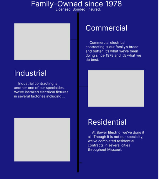
The next section of the homepage goes over the types of services offered. The blank spaces will be stock images related to the heading on the other side of the tree. On mobile, the text will overlay on the image, they will stack in one column, and there will be no tree.
I made a point to include that they were family-owned, established, as well as Licensed Bonded and Insured. This builds customer confidence in the business.
I will likely use a Bootstrap Grid to build this section.

I will also use cards to display the current projects. They will stack on mobile. The current projects gives an idea of the contractors workload as well as what the staff is freshly-trained to do.
The simple footer on the bottom provides contact info and a nav on the bottom for user-friendliness.
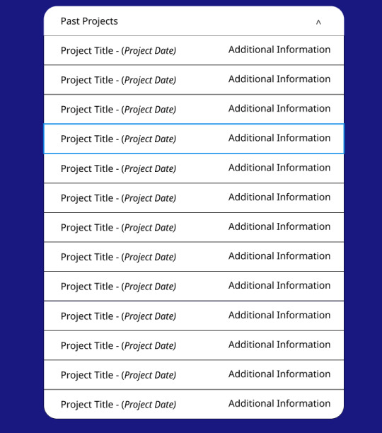
About Us:
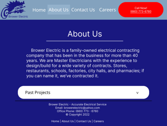
The about us page is simple and straightforward, because that's how these folks run their business. A past projects accordion will be a space-efficient way to include all their projects (there are a lot, these guys have been in the biz for decades.)
Contact Us:

I decided to display the contact information on cards in the contact us page. The large central card serves as a general directory on what number to call to get things done quickly. I left the former owner on the site, but excluded his contact information. People looking for Mike Brower's company now know that it is still in business, this is it's website, and that Mike is retired.
Donald doesn't like to be contacted directly. So I put a message on his card to funnel contact through someone else first.
Careers:
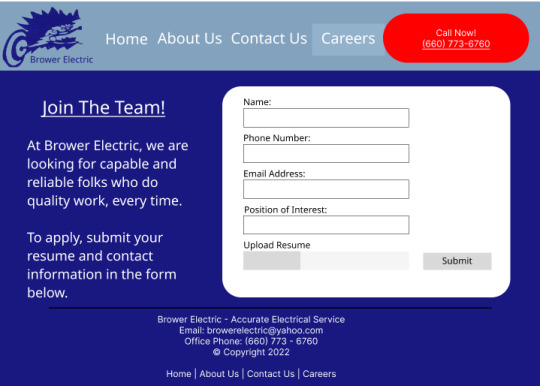
This page is a simple form submission for a resume. It is very bare bones because the client requested something simple that just lets him do a quick initial screen and initiate contact himself.
They are always hiring for different positions so the user must specify what kind of job title they are looking for.
Conclusion:
Designing this site was fun! I don't really consider myself a creative so building something like this was a great confidence booster. I feel very confident in my ability to code this website for 2 reasons: first, I have built very similar things before, such as the glamourscreens website I built earlier this semester; second, most everything I have included in this website has extensive support included in Bootstrap 5.
This feels like some of my best work yet, and I feel confident that it is something the client will be very pleased with too.
3 notes
·
View notes
Photo

Wokiee Multipurpose WooCommerce WordPress Theme - 2022
**What is Wokiee Theme?**
The Wokiee WooCommerce Theme goes above and beyond the norm. It's a fantastic design tool. Wokiee is a fantastic WooCommerce Premium theme. It will be ideal for your current or prospective online store. It is considered a powerful design tool rather than just a theme. If you want to open an online store in the near future or already have one, Wokiee is the ideal platform for you. Your eCommerce store will appear more responsive and so attract more customers if you use Wokiee. This is a premium WooCommerce theme. For your store, Wokiee is the finest option!
For details please read this article on Ajrblog - Wokiee Multipurpose WooCommerce WordPress Theme - 2022
**WOKIEE Theme Features Overview:-**
1/Quickstart Package & Theme Package Demo data is included. 2/Install Demo Data with a Single Click and Customize Easily with a Powerful Admin Panel 3/Built using latest technologies like Bootstrap 4.x, HTML5/CSS3 4/Design That Is Both Creative And Modern 5/Completely Responsive 6/Support for RTL 7/12 Different Header Designs 8/Various functions 9/25+ Homepage Layouts 10/6 Product page variants 12/12 Various Footer Styles 13/Banner and Slideshow Manager for the Modern Era 14/Admin Panel for a Strong Theme 15/Support for several languages
**WOKIEE Plans & Pricing:-**
**Regular License** $59 Use, by you or one client, in a single end product that end users are not charged for. The total price includes the item price and a buyer fee.
**View license details**
Quality checked by Envato Future updates 6 months of support from SmartDataSoft The price is in US dollars and does not include taxes.
For details please read this article on Ajrblog - Wokiee Multipurpose WooCommerce WordPress Theme - 2022
**What's Good About WOKIEE Multipurpose Theme**
**wokiee theme support**
They guarantee that all of their users' questions and concerns will be answered in less than 24 hours or one working day. Users may quickly create an open support ticket to contact WOKIEE's customer service team and ask inquiries. They keep track of your query and send it back to you. All queries are personally processed, and help is available Monday through Friday, 24 hours a day. They will make every effort to react as quickly as feasible.
**Why is Wokiee Theme the first choice of the online store?**
Because Wokiee Theme isn't your normal theme. It's a highly efficient design tool. This theme comes with all of the tools and modules you'll need to build a lightning-fast, mobile-friendly, responsive website with great UX. With a number of layouts and styles to choose from, you can create a fresh new design for your website while still including all of the essential features. You may save money and time on web design by using the Wokiee premium theme.
For details please read this article on Ajrblog - Wokiee Multipurpose WooCommerce WordPress Theme - 2022
3 notes
·
View notes
Text
Eshkool – Education WordPress Theme
Eshkool is a versatile and modern Education & LMS WordPress theme designed to cater to all educational institutions. Whether you’re running a university, college, school, kindergarten, training center, or course hub, Eshkool has got you covered!
Why Eshkool?
Stunning Demos: Choose from 6 unique homepage demos tailored for different educational needs, including Kindergarten, University, and One Instructor options.
Comprehensive Layouts: Includes various LMS course page layouts, inner page layouts, and more to showcase your courses, instructors, and events effectively.
Responsive Design: Built with Bootstrap 4, ensuring your site looks great on all devices.
Easy Customization: With WP Bakery Page Builder and one-click demo installer, setting up and customizing your site is a breeze.
Powerful Plugins: Integrated with LearnPress, Revolution Slider, WooCommerce, and MailChimp for a seamless experience.
SEO-Friendly: Optimized for search engines to improve your online visibility.
RTL Support: Fully supports right-to-left languages for global reach.
Key Features:
Header Variations: Choose from 4 distinct header styles to fit your website’s aesthetics.
Unlimited Color Options: Customize your site’s color scheme to match your brand.
Blog Layouts: Share educational insights with 5 different blog layouts.
Event Management: Announce and detail upcoming educational activities with ease.
Instructor Profiles: Highlight the expertise of your educators.
One-Click Demo Installer: Get started quickly with pre-built demos.
🔗 Explore Eshkool WordPress Theme
#Eshkool#EducationTheme#WordPressTheme#LMS#OnlineLearning#ResponsiveDesign#LearnPress#EducationWebsite#SchoolWebsite#UniversityWebsite#WPBakery#SEO#WooCommerce#EducationBlog#EventManagement
0 notes